Ubiquity Repositories
Date
May - September 2019
Position
Design Intern
Summary
Ubiquity Press is an academic publisher focusing on open access publication. Their mission is to make quality open-access publishing affordable for everyone and create academic tools for research. As one of their very first designers, my team designed their flagship repository product to empower academics and researchers.
Ubiquity Repositories
Date
May - September 2019
Role
Design Intern
Summary
Ubiquity Press is an academic publisher focusing on open access publication. Their mission is to make quality open-access publishing affordable for everyone and create academic tools for research. As one of their very first designers, my team designed their flagship repository product to empower academics and researchers.
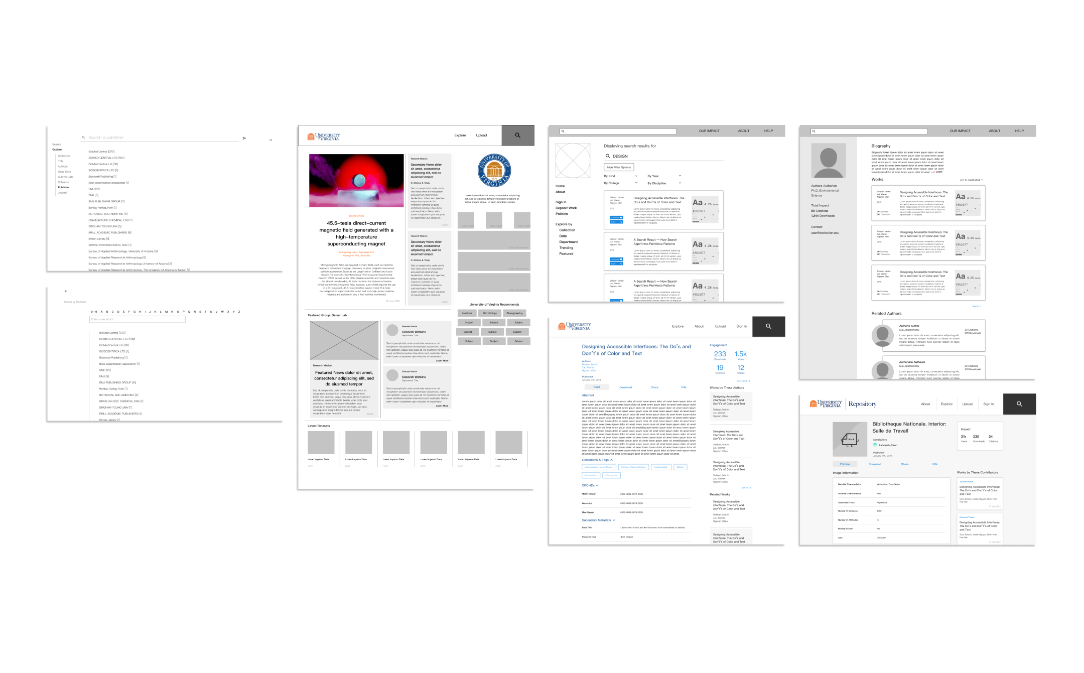
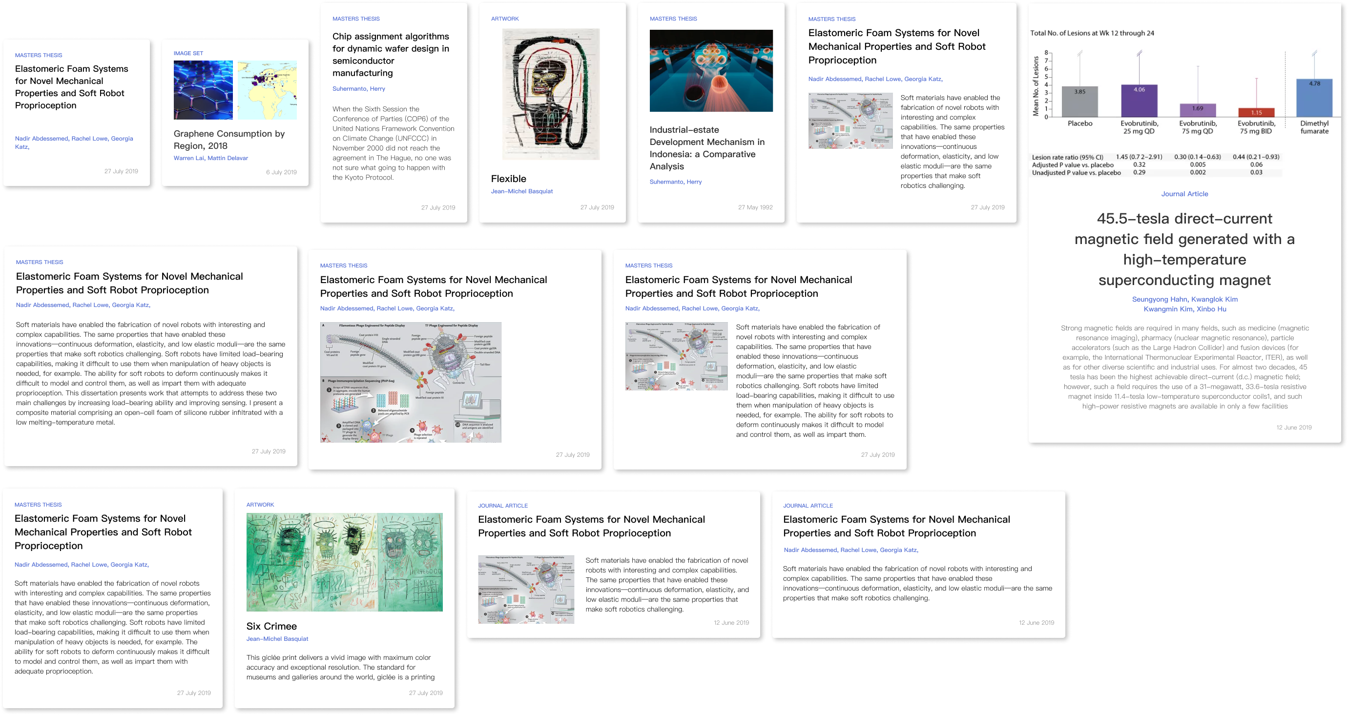
Exhibit
A brief survey of finalized interface mockups. These interfaces were used as demos for prospective institutions and user testing prototypes.
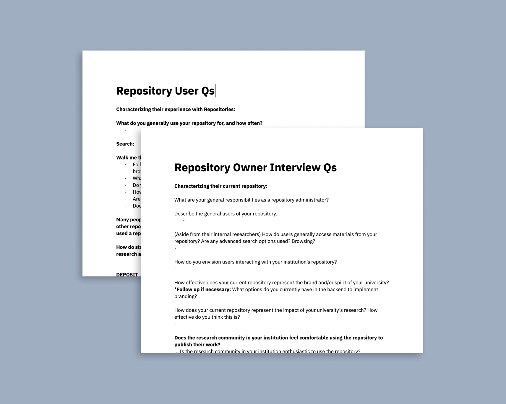
Needfinding
Core Insights
Through extensive competitive analyses and user interviews with various figures in academia, we learned about various use cases and perceptions of current repositories.
Based on our research we derived three design goals that Ubiquity Repositories is based on.
i. Communicates ready-to-use experience
A repository's interface should invite the user to engage with the platform and its contributors. It should consistently update its materials to communicate the impact of the work being done at the institution.
ii. Search that feels in control
The repository must create a search process that communicates ease of control and seamlessly integrate with the information architecture of the repository.
iii. Convey impact of authors + work
The repository must present statistics that demonstrate the impact of the authors' work and should serve as a platform for discovering researchers in mutual fields.
User flow design
Incorporating mental models
From our interviews, we learned that most people conceptualized the repository into two functionalities: “Search” and "Explore”.
While “Search” served users with specific queries, “Explore” served users who wanted to broaden their search from a single query. We used this distinction to broadly shape our user flow. This allowed us to retain a level of familiarity when designing the visual interface.
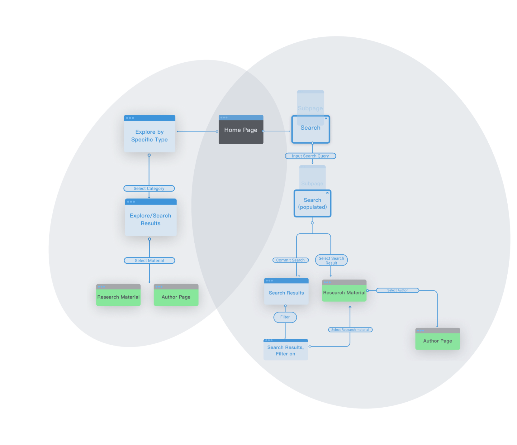
A simplified user flow depicting the two main functionalities. The left half illustrates “Explore”, the right illustrates “Search”.
A brief glance
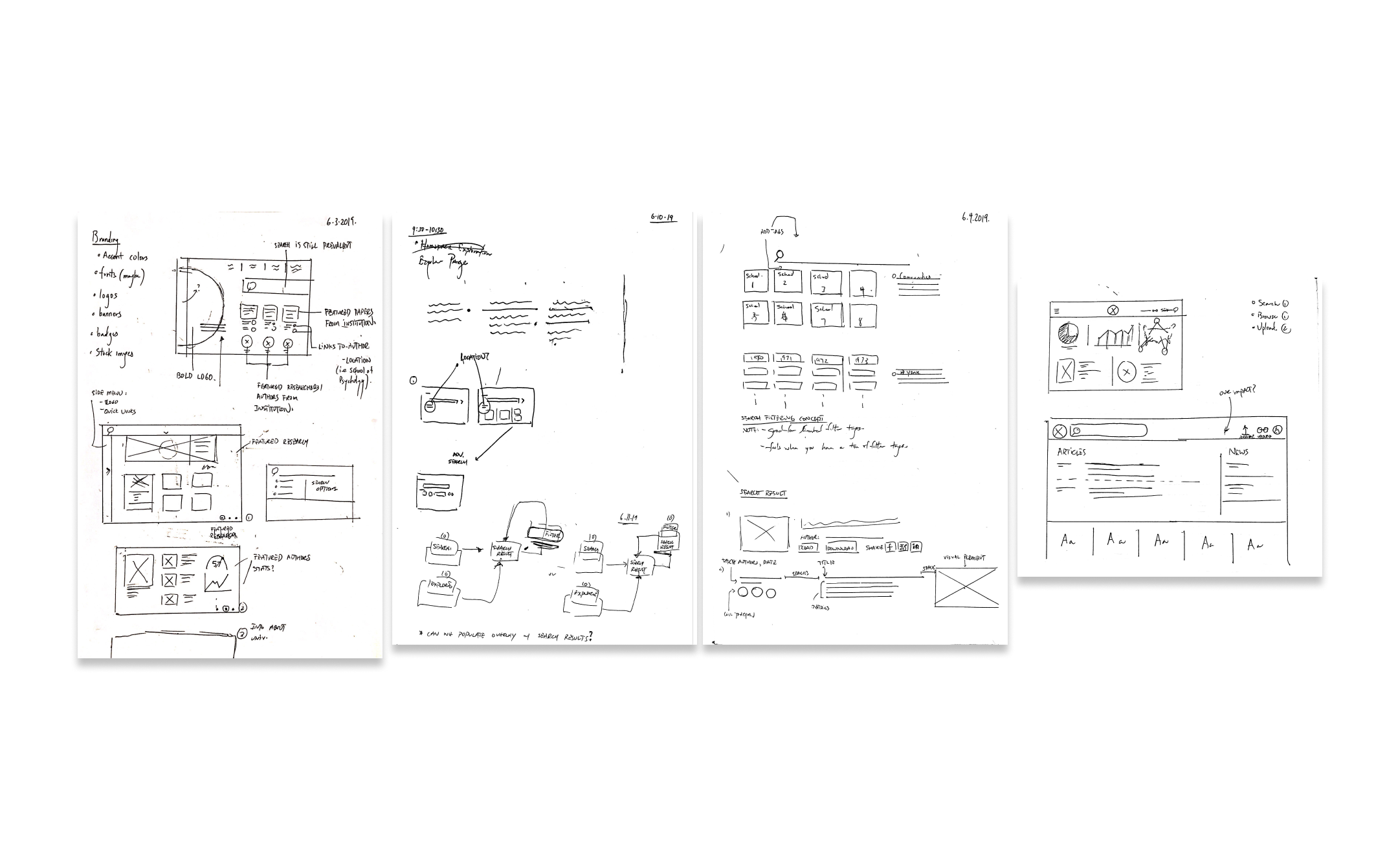
Ideation
A variety of low-fidelity sketches done in pen/paper and Figma. We explored a different direction that strayed away from traditional repository interfaces.
Modular design components
Giving customization options to managers
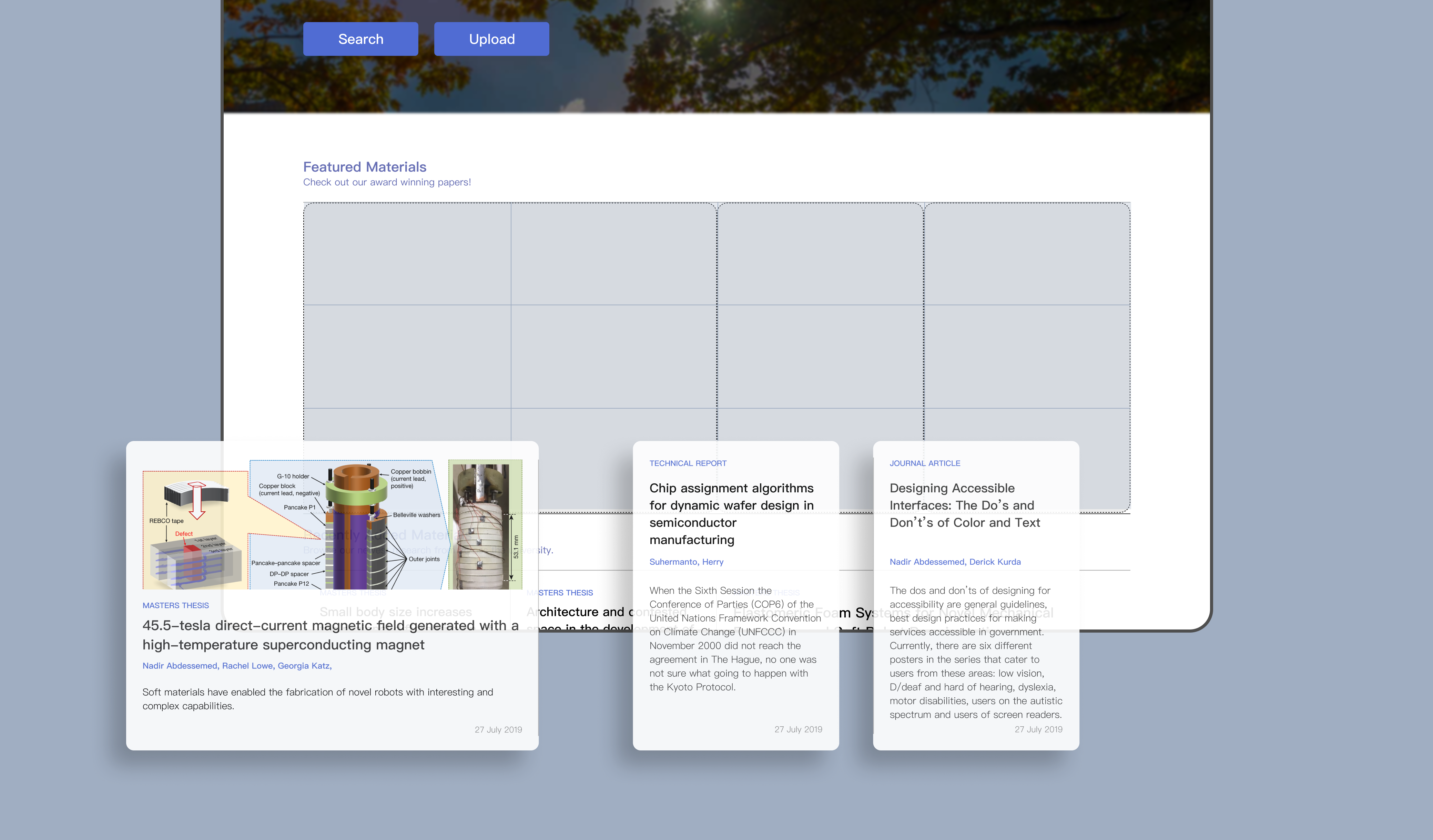
One of the very first problems we heard about during user
research was the lack of customization options for
repositories. Repositories were seldom updated, and could
not showcase any relevant research. Could we design the
repository in a way where managers could easily customize
their repositories?
Inspired by online newspapers and journals, we created modular
design components that could be easily inputted with information
and displayed immediately.
Working within the constraints of our grid system, we designed a modular card system to accompany different size cards, and to accommodate different types of media. With this system in place, managers can easily update and customize their repository by choosing a specific card style and inputting the relevant information.
User testing
Validating our results
With a prototype of the core functionality, we reached out to some of the repository users and owners that we previously interviewed to get their feedback.
Branding presence was too pronounced
One concern we received was that our homepage looked like a University landing page. The banner we had designed was far too large and served solely to inject the institution’s branding. In addition, users were not accustomed to the lack of a search bar. We decided to input a search bar into the banner and shorten it to surface more repository content on the landing page.
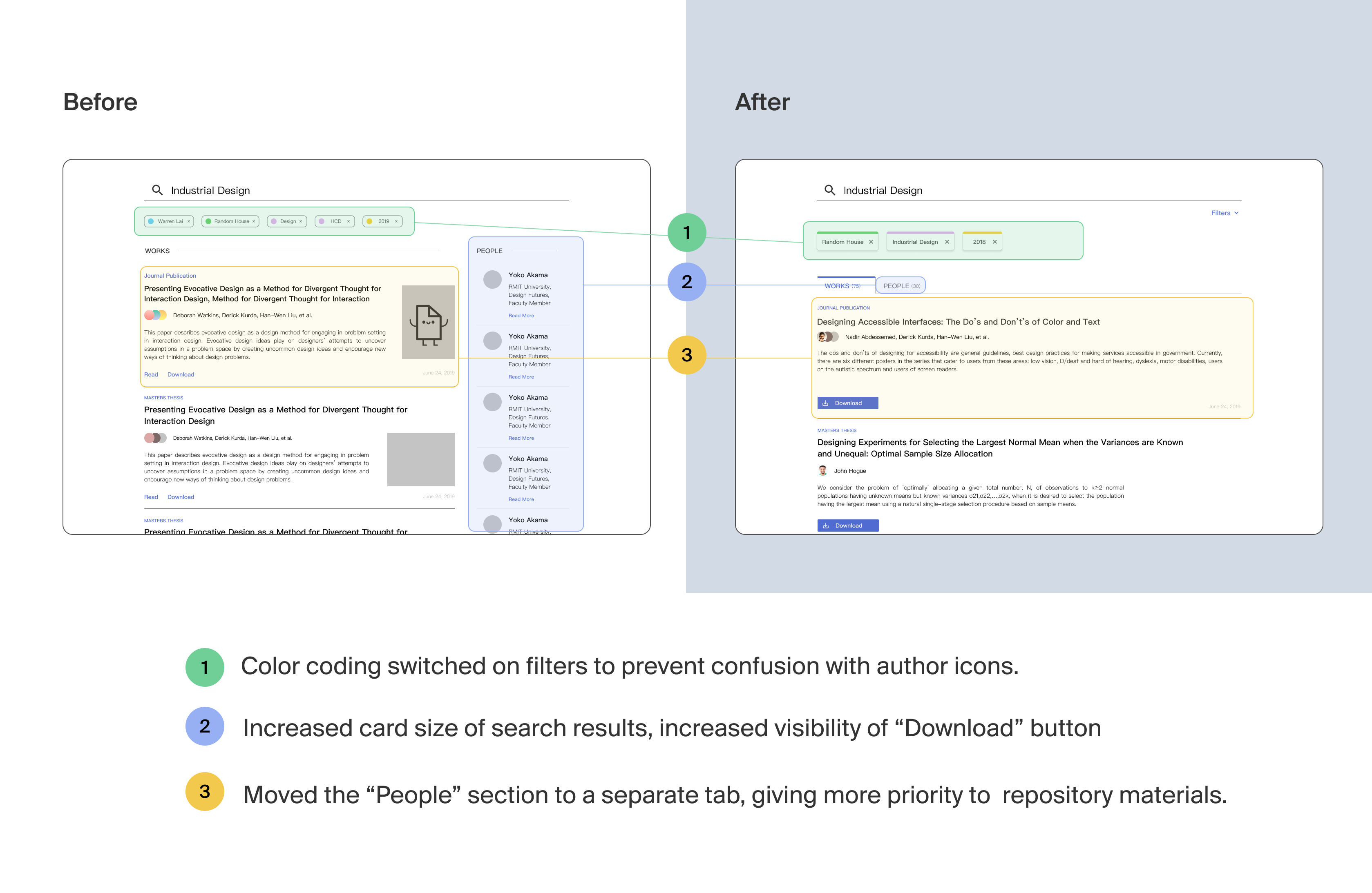
Unexpected search results
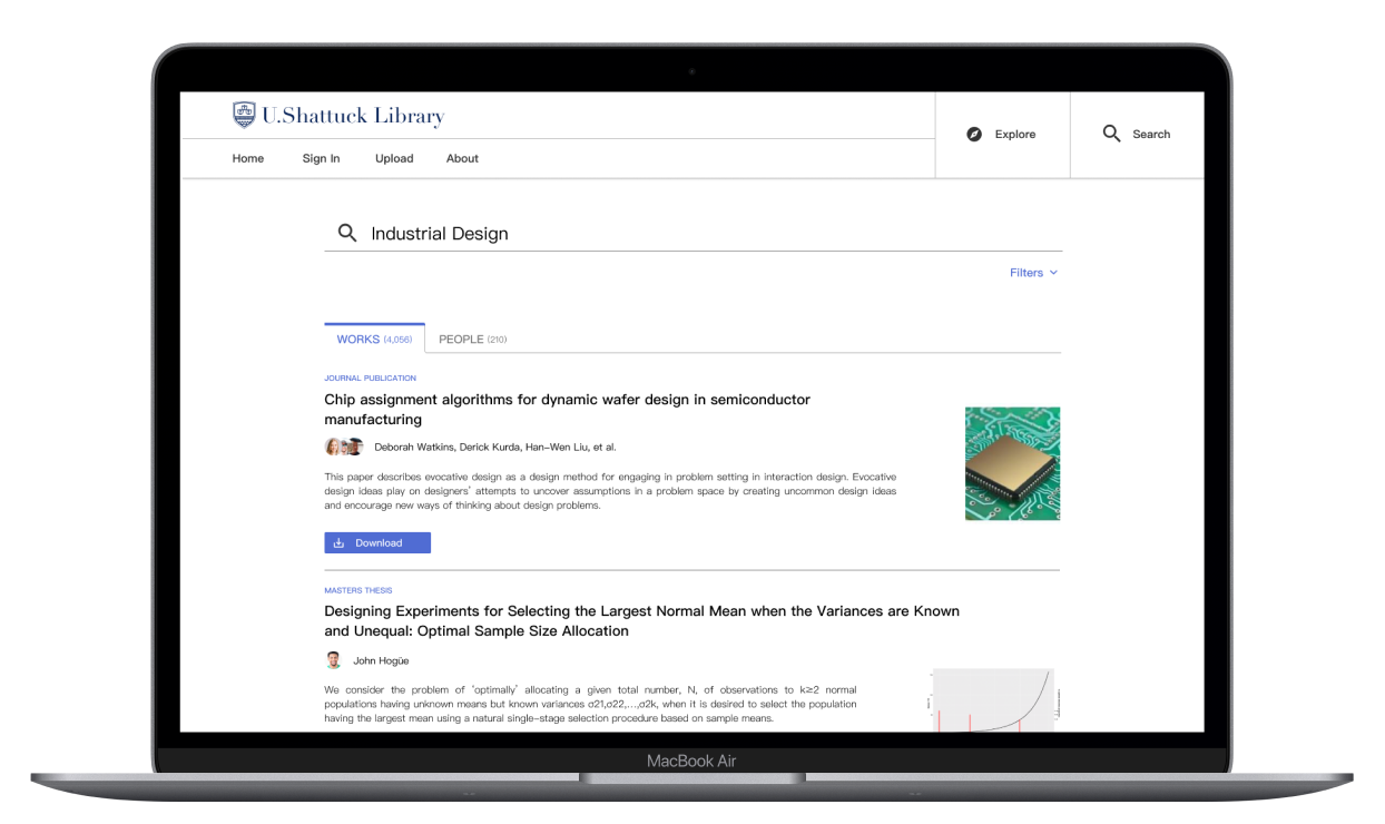
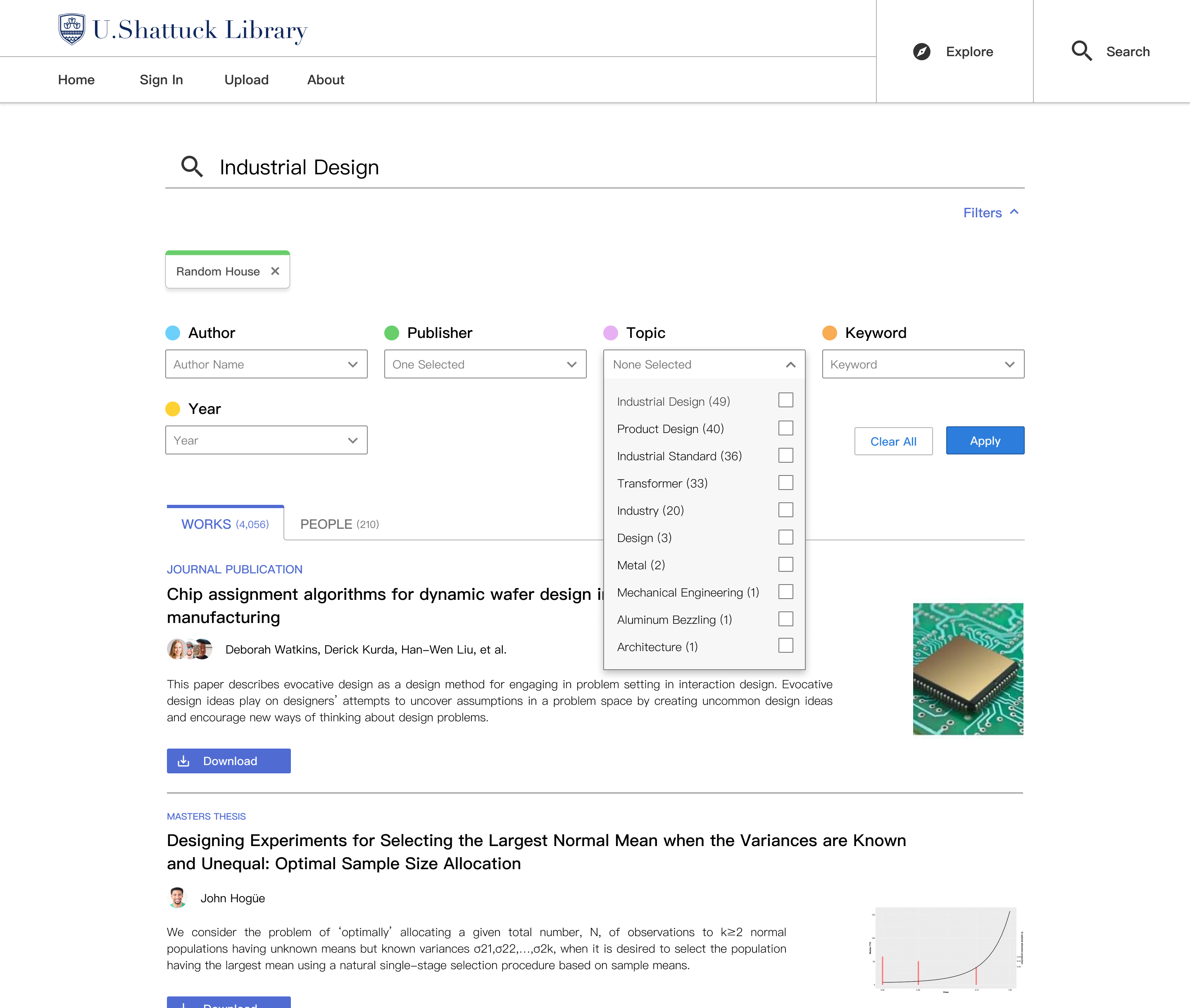
Apart from the homepage, the “Search Results” page was the second most likely to become cognitively overloaded. We opted to add an “People” tab in the search results because people felt distracted by the side panel displaying results for relevant figures in their institution. We also adjusted the color-coding design on our filter tags to avoid confusion with author icons.
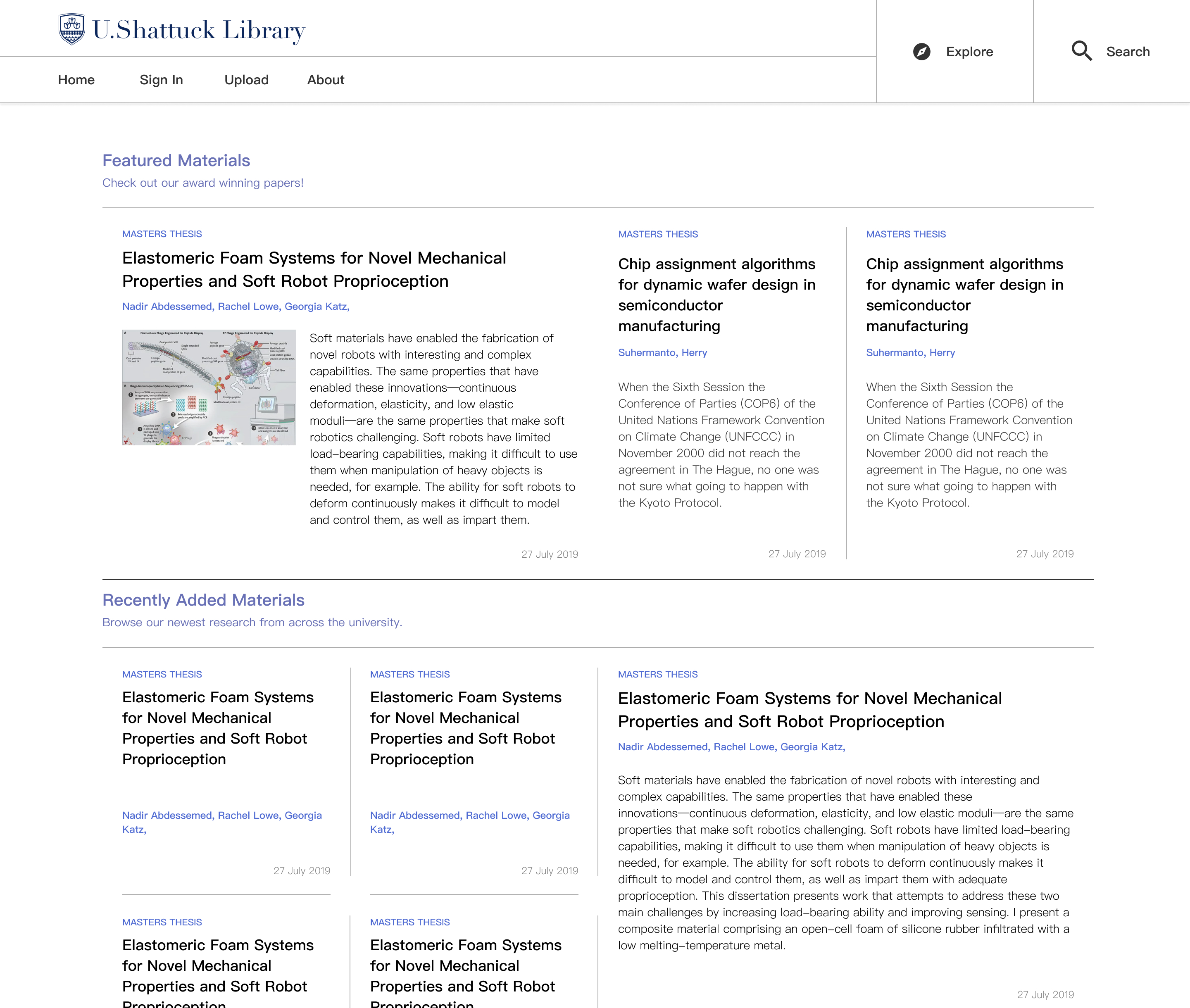
Final product
The objective of Ubiquity Repositories was to
devise a digital system that simplifies the
process of discovery in research: from searching
for relevant articles, connecting with researchers
in your field, applying to one’s own work, and
finally publishing research to share to the world.
Here are some breakdowns of the final designs.
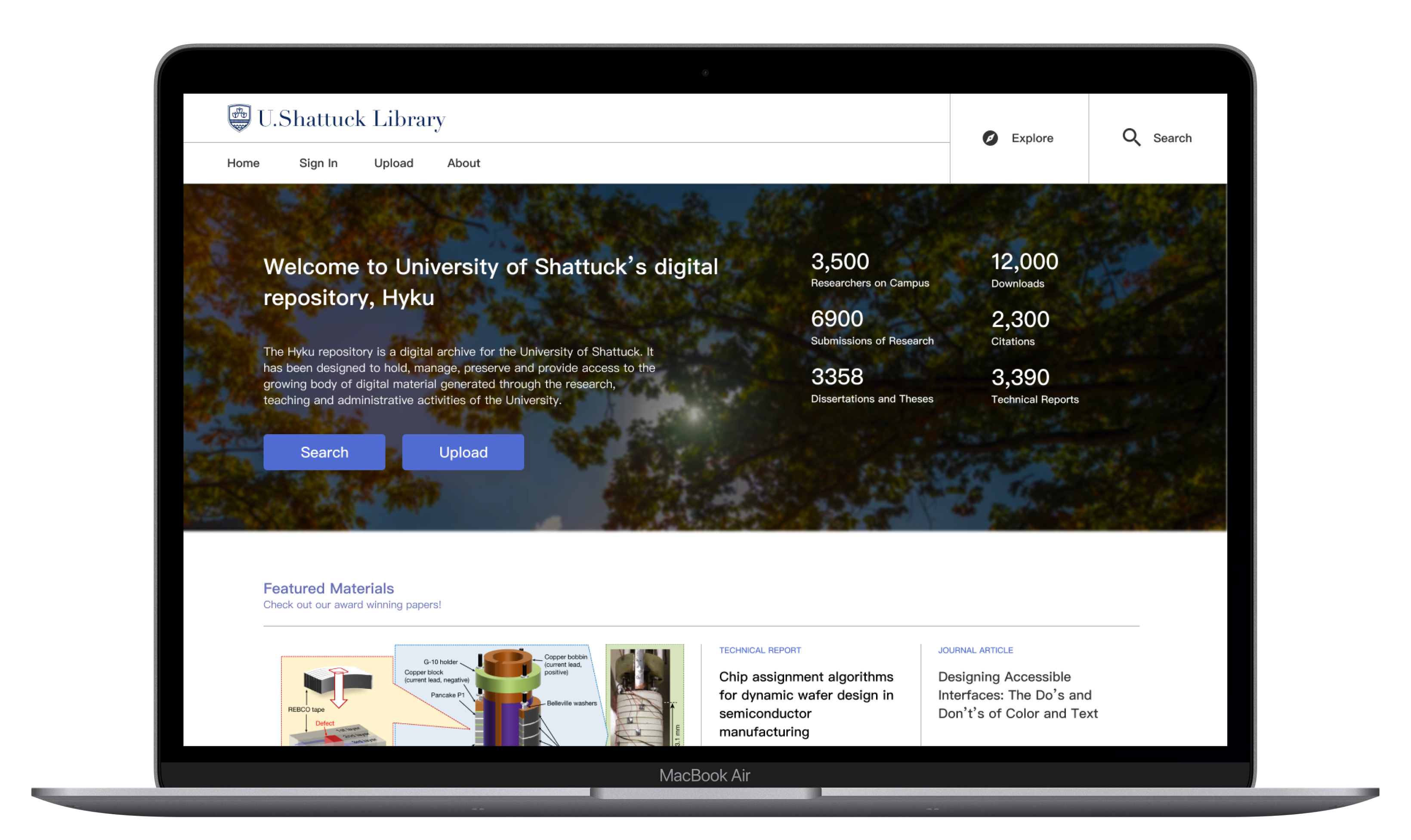
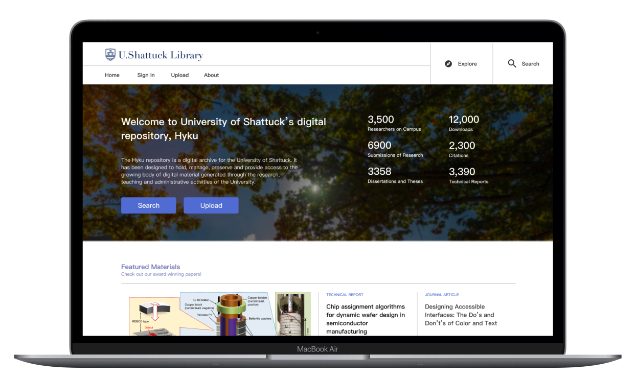
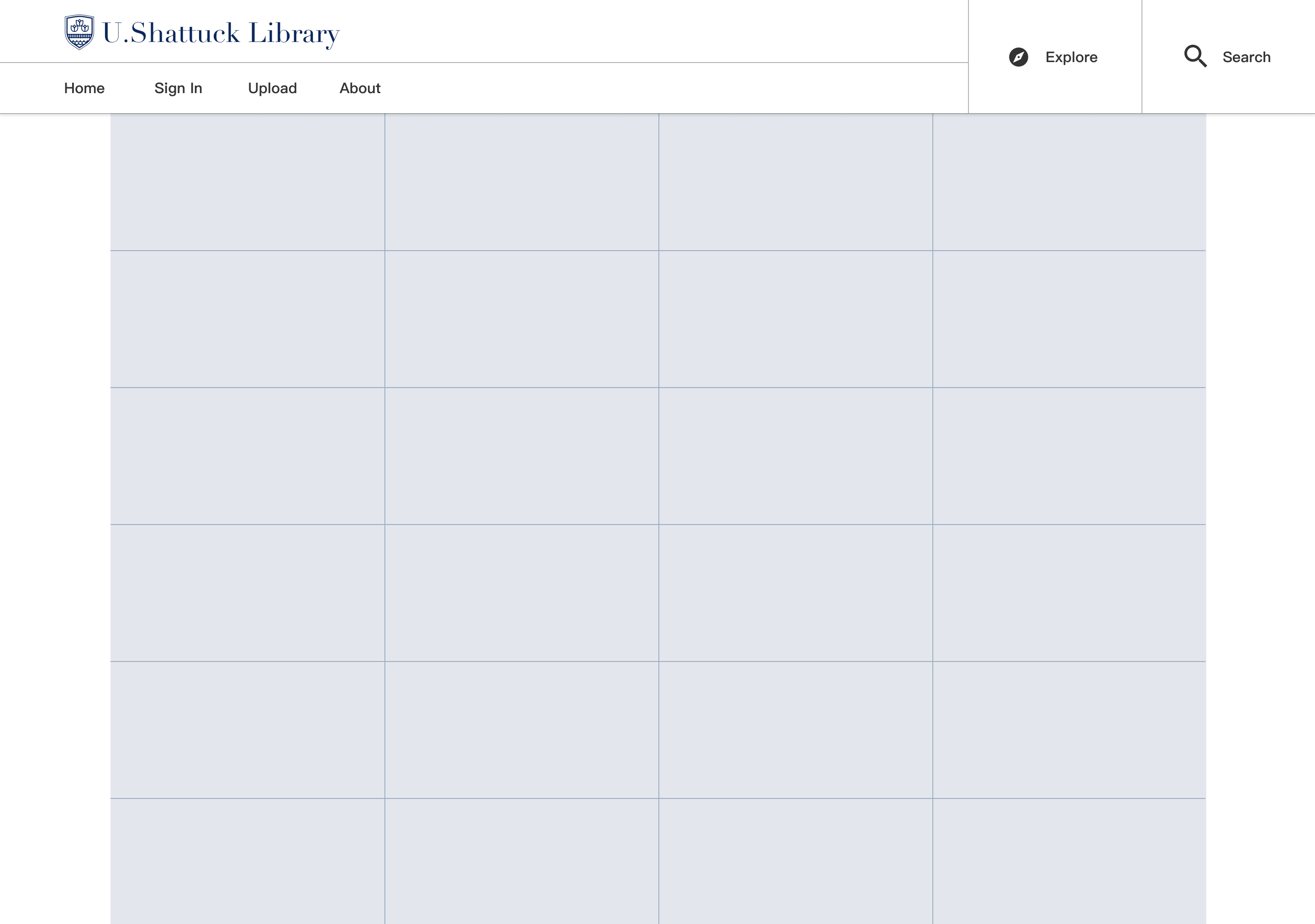
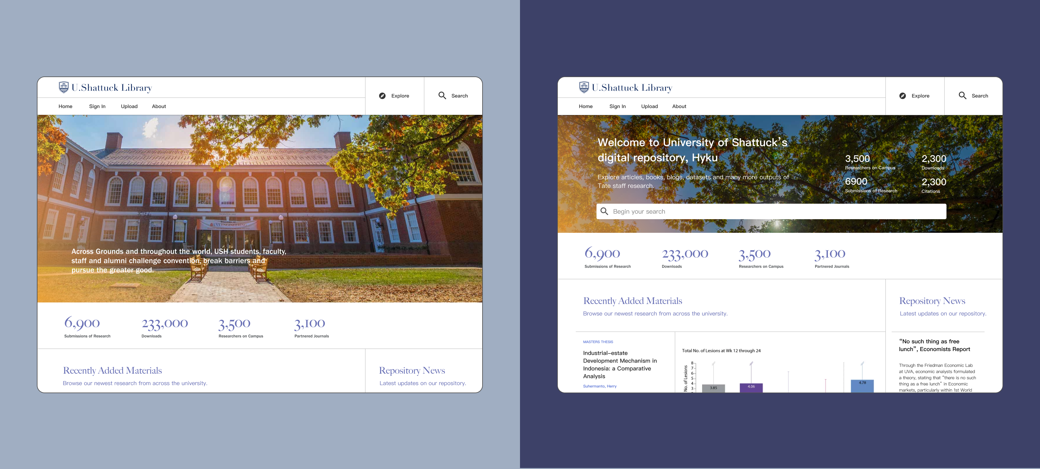
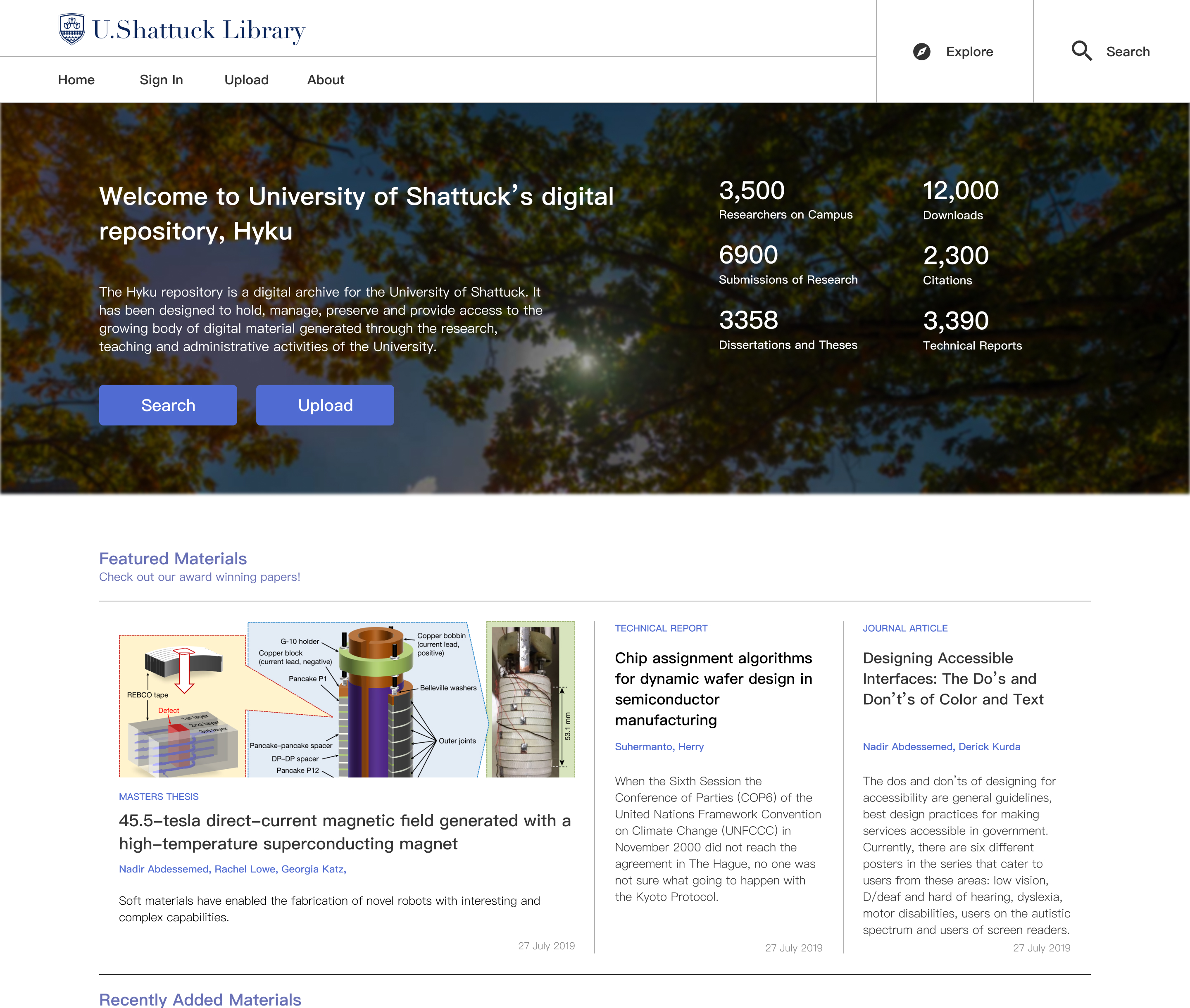
Homepage
Establishing Significance
The homepage proudly showcases the research being done at the university
and provides easy access to the main search functions of the repository.
We designed this homepage to flexibly display different types of media: from
art archives to technical research articles.
.jpg)
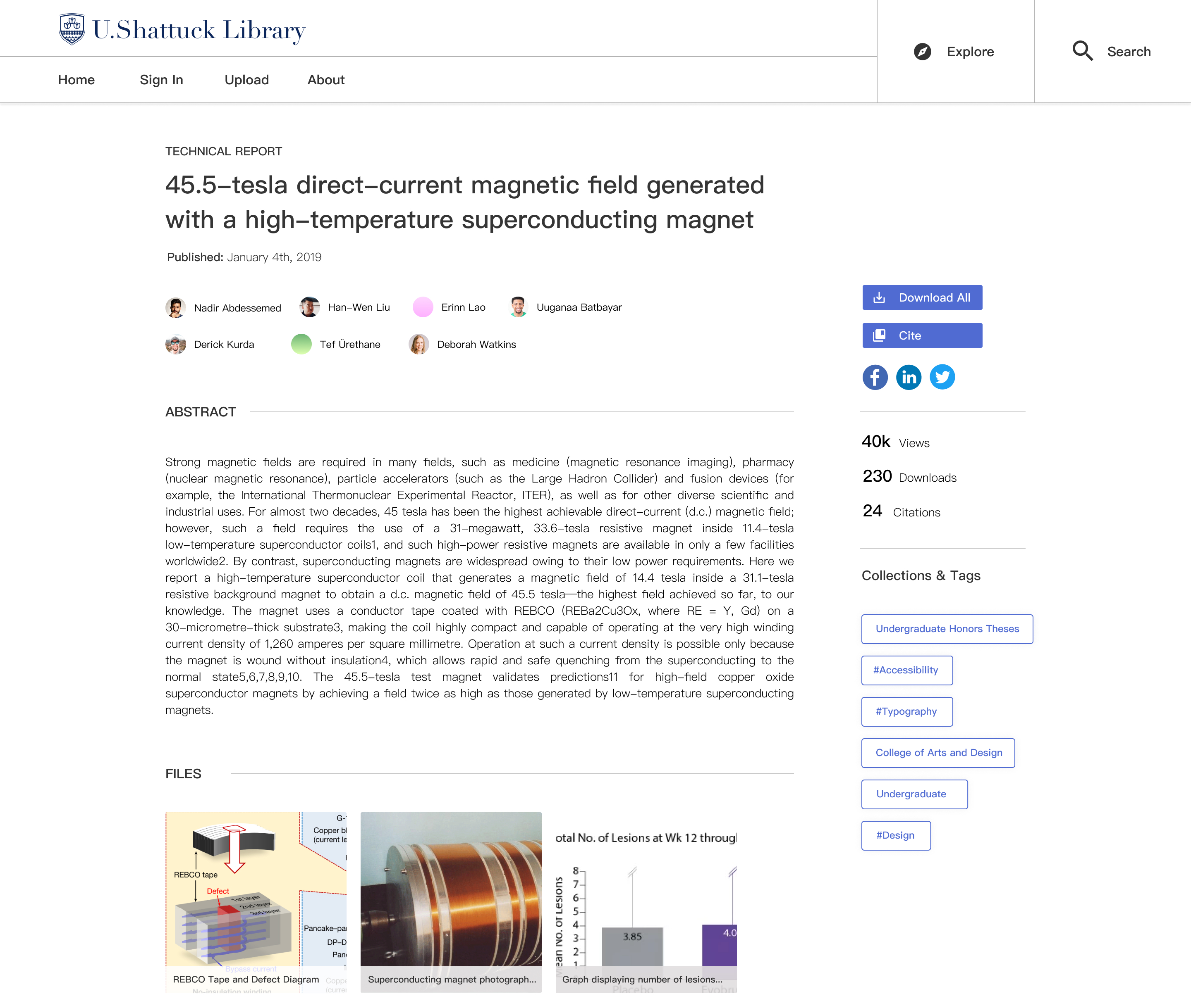
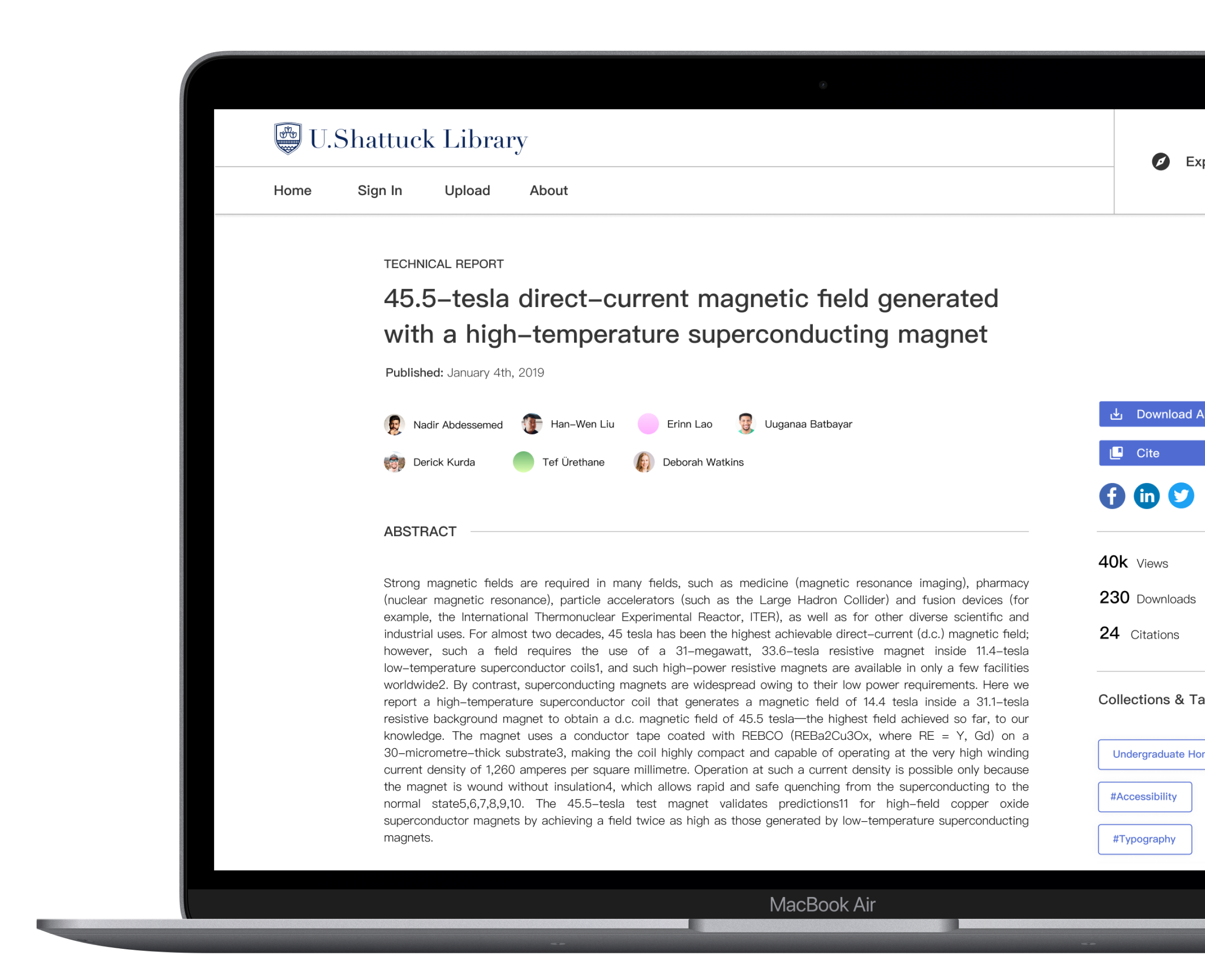
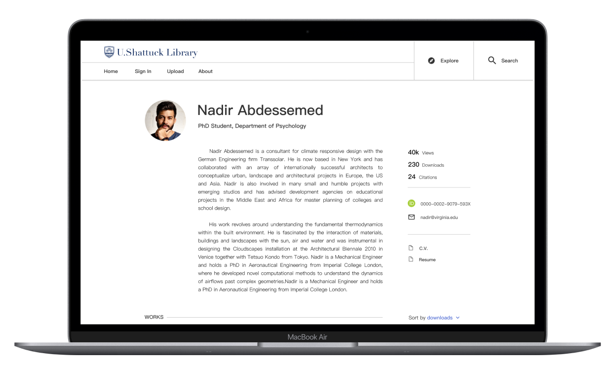
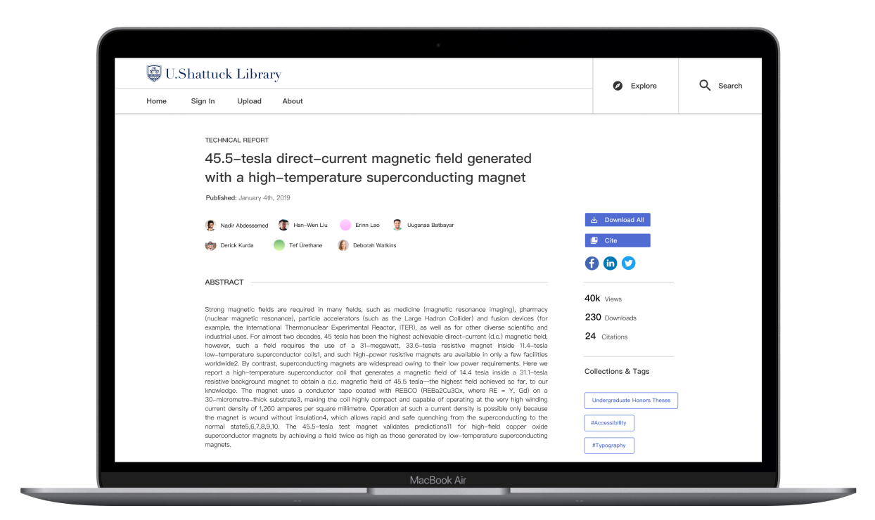
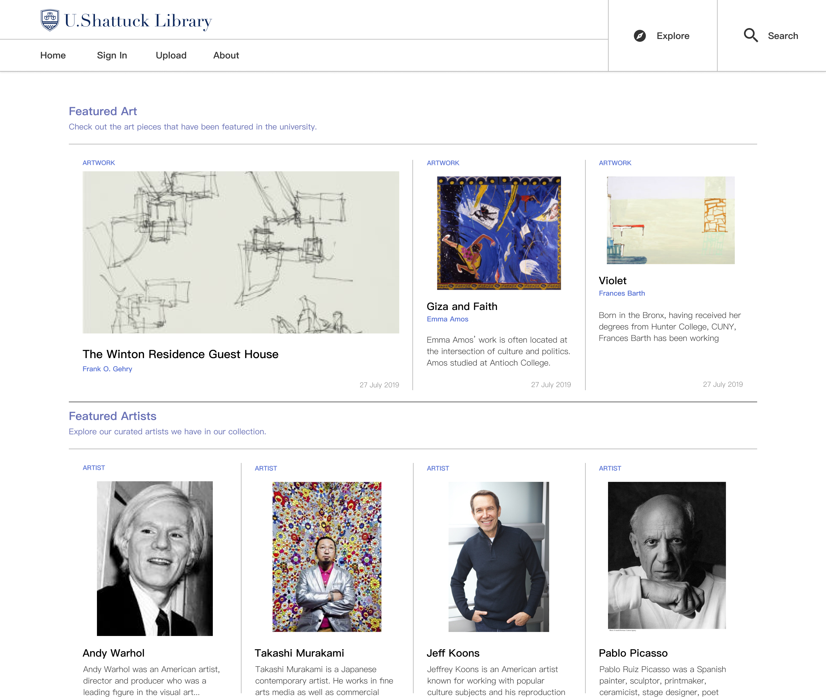
Works + Author
Clear and Concise
Displays key pieces of information describing the research material.
Researchers can use this page to cite, download, or overview the work.
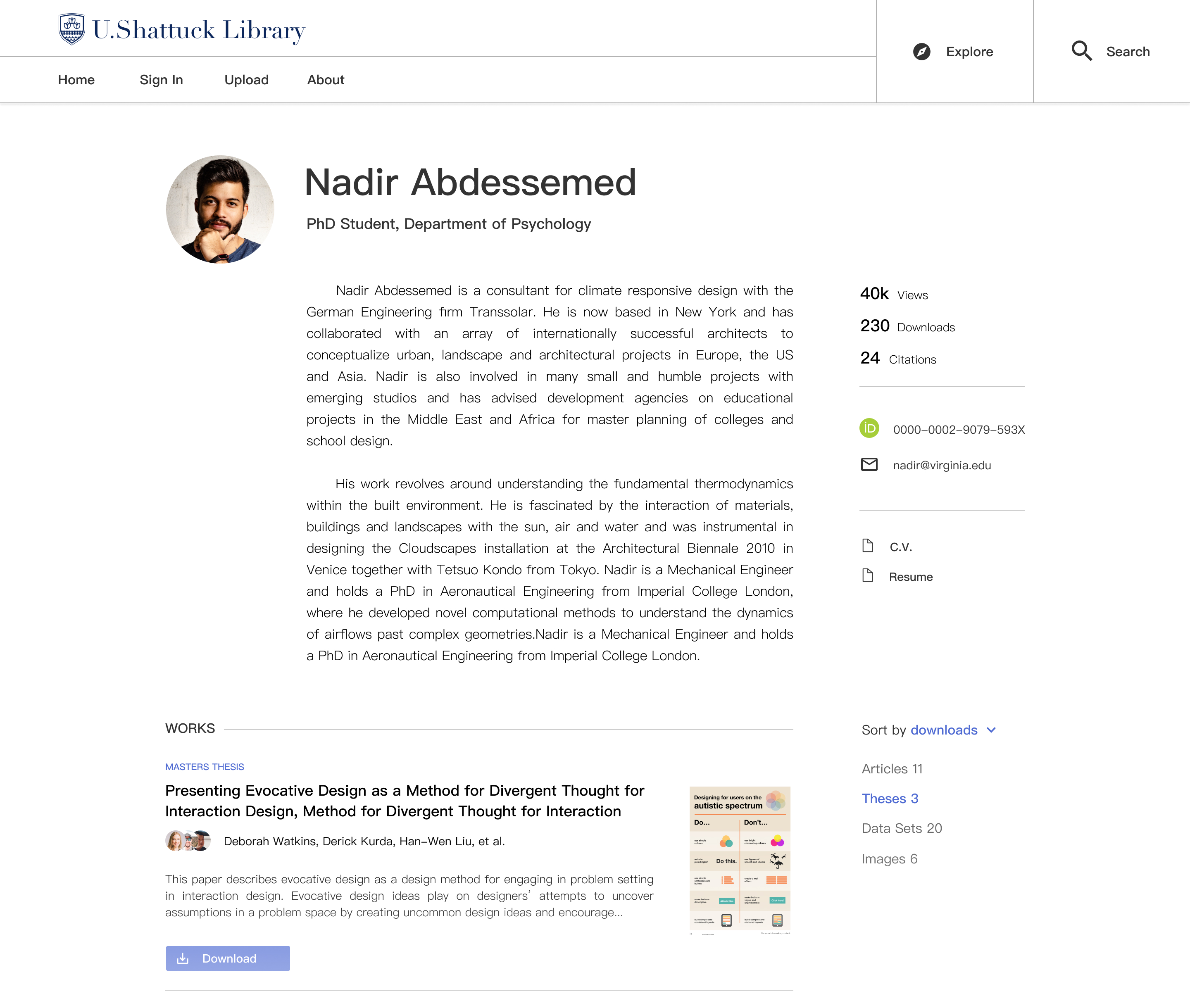
Authors within the institution can create a dedicated profile page where
they can be discovered by the larger scientific community.
This page can be customized this to showcase their academic interests
and other works they’ve contributed to.
Search Results
Discovering Articles Faster
Displays research materials and author profiles from the institution. Allows users to easily filter results for specific search queries.
Reflection
Looking back
This internship gave me the opportunity to flex my design muscle,
and to do some serious learning on the side. I appreciated the moments
where I could spend time to learning a foreign design principle, and
then immediately apply them to the project that I was working on.
After this internship, I walked away with a sharper eye for
understanding design systems, accessibility standards,
and in-depth user testing.
I look forward to designing with more intentionality,
and applying the lessons that I learned here to my future projects.
The design also eventually shipped (woohoo!) and adopted by the British
Library to pilot a shared repository service with cultural organizations
such as the British Museum, Tate, National Museums Scotland and MOLA (Museum of London Archaeology).